> ## Documentation Index
> Fetch the complete documentation index at: https://docs.textql.com/llms.txt
> Use this file to discover all available pages before exploring further.
# Python
> Visualize and analyze your data
After Ana queries your data with Text to SQL or Ontology, Python transforms and visualizes it. Just describe what charts or analysis you want—you never need to write code yourself.
**Works with SQL Tools:** Python is typically used alongside Text to SQL or Ontology. Ana queries your data first, then uses Python to create visualizations and perform additional analysis.
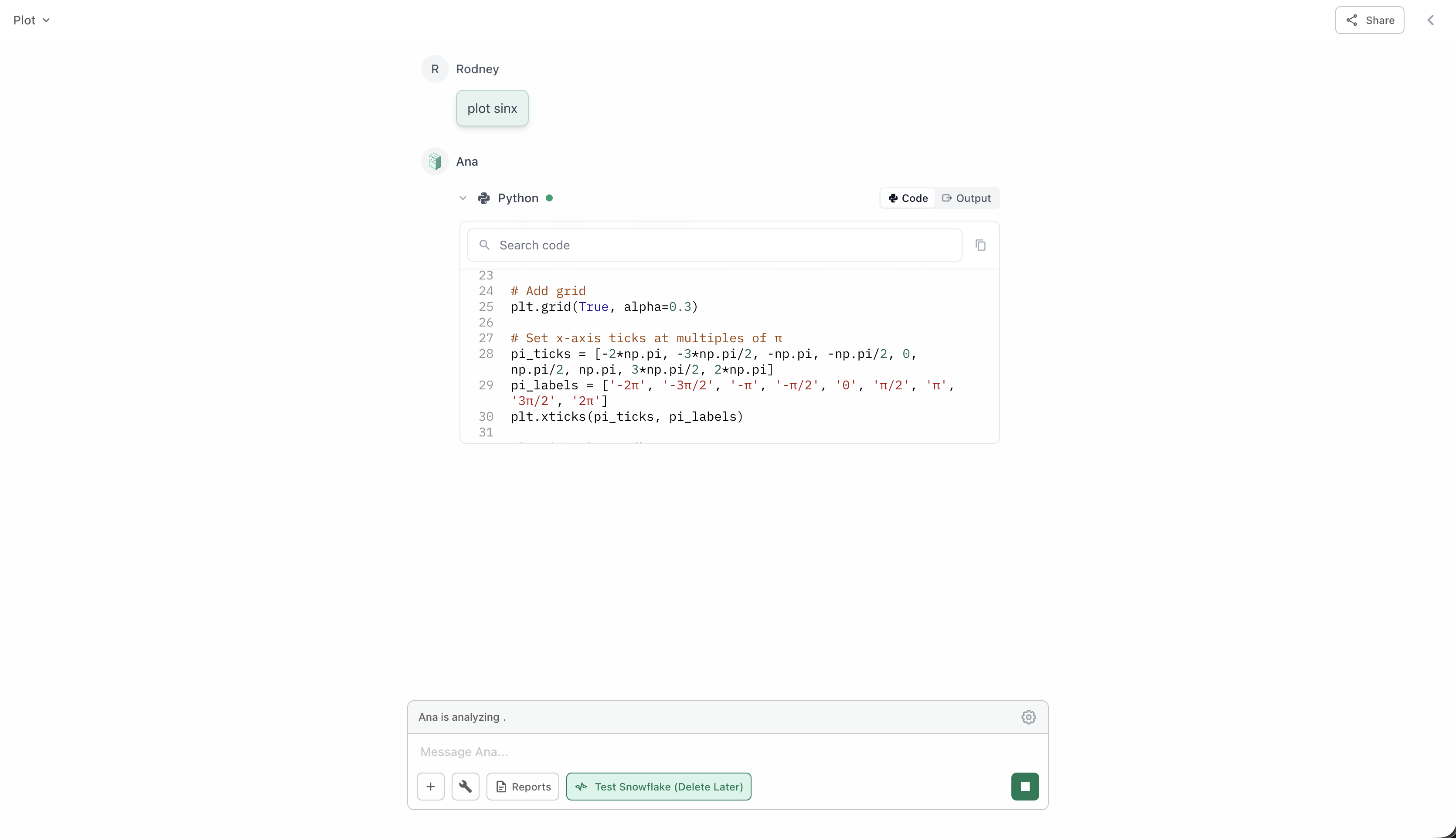 ## Primary Use: Data Visualization
Python is mainly used to create visualizations from data retrieved by Text to SQL or Ontology queries:
"Create a bar chart of this data"
"Show monthly trends as a line chart"
"Make a pie chart of sales by category"
"Build a scatter plot with trend line"
"Create a heat map of correlations"
"Show this as a stacked area chart"
"Plot customer locations on a map"
"Show sales by region on a map"
"Create an interactive map with markers"
"Show the distribution as a histogram"
"Create a box plot by segment"
"Make a correlation matrix"
## When to Use
Python works best after you've retrieved data with Text to SQL or Ontology:
Start by getting the data you need using Text to SQL or Ontology.
**Example:** "Show me monthly sales by region for 2024"
Once you have the data, ask Ana to create visualizations or perform calculations.
**Example:** "Create a line chart of those trends" or "Calculate the growth rate"
### Common Workflows
**The most common pattern:**
1. "Get total sales by product category"
2. "Create a bar chart of that data"
Ana queries your database, then visualizes the results.
**Using your semantic layer:**
1. "Query my 'Monthly Revenue' metric"
2. "Show it as a trend line with forecasts"
Ana uses your pre-defined metrics, then creates visualizations.
**Multi-step analysis:**
1. "Get customer purchase history"
2. "Calculate the average order value per customer"
3. "Show the distribution as a histogram"
Ana queries, calculates, then visualizes.
## Tips for Better Visualizations
Tell Ana exactly what kind of chart you want.
**Good:** "Create a stacked bar chart showing monthly revenue by product line"
**Vague:** "Make a chart"
If a visualization isn't quite right, just ask for adjustments.
**Examples:**
* "Make that chart larger"
* "Use different colors"
* "Sort by highest to lowest"
* "Add a trend line"
You can ask for multiple charts to compare different views.
**Example:** "Show me a bar chart and a trend line of the same data"
Ana can calculate additional metrics to visualize.
**Example:** "Show the data with moving averages" or "Add percentage changes"
## Example Visualization Requests
Real examples of how SQL + Python work together:
**Request:**
* "Get sales by month, then show it as a line chart"
* "Query top 10 products and create a bar chart"
* "Show customer distribution by state on a map"
**Request:**
* "Get daily revenue for the year and show trends"
* "Query user signups over time with a trend line"
* "Show seasonal patterns in sales data"
**Request:**
* "Compare this quarter vs last quarter as a grouped bar chart"
* "Show revenue by region side-by-side"
* "Create a heat map comparing products and regions"
**Request:**
* "Show a scatter plot of price vs units sold with a regression line"
* "Create a box plot showing distribution by segment"
* "Build a correlation matrix of our key metrics"
## What Else Python Can Do
While visualization is the primary use case, Python can also:
* Calculate growth rates and percentages
* Compute moving averages
* Find totals and subtotals
* Determine min/max values
* Export processed data as CSV
* Create Excel files with multiple sheets
* Generate formatted reports
* Calculate correlations
* Perform basic regression
* Show distributions
* Identify outliers
**Best Practice:** Always start with a SQL query (Text to SQL or Ontology) to get your data, then use Python to visualize or analyze it. This workflow gives you the best results.
## Primary Use: Data Visualization
Python is mainly used to create visualizations from data retrieved by Text to SQL or Ontology queries:
"Create a bar chart of this data"
"Show monthly trends as a line chart"
"Make a pie chart of sales by category"
"Build a scatter plot with trend line"
"Create a heat map of correlations"
"Show this as a stacked area chart"
"Plot customer locations on a map"
"Show sales by region on a map"
"Create an interactive map with markers"
"Show the distribution as a histogram"
"Create a box plot by segment"
"Make a correlation matrix"
## When to Use
Python works best after you've retrieved data with Text to SQL or Ontology:
Start by getting the data you need using Text to SQL or Ontology.
**Example:** "Show me monthly sales by region for 2024"
Once you have the data, ask Ana to create visualizations or perform calculations.
**Example:** "Create a line chart of those trends" or "Calculate the growth rate"
### Common Workflows
**The most common pattern:**
1. "Get total sales by product category"
2. "Create a bar chart of that data"
Ana queries your database, then visualizes the results.
**Using your semantic layer:**
1. "Query my 'Monthly Revenue' metric"
2. "Show it as a trend line with forecasts"
Ana uses your pre-defined metrics, then creates visualizations.
**Multi-step analysis:**
1. "Get customer purchase history"
2. "Calculate the average order value per customer"
3. "Show the distribution as a histogram"
Ana queries, calculates, then visualizes.
## Tips for Better Visualizations
Tell Ana exactly what kind of chart you want.
**Good:** "Create a stacked bar chart showing monthly revenue by product line"
**Vague:** "Make a chart"
If a visualization isn't quite right, just ask for adjustments.
**Examples:**
* "Make that chart larger"
* "Use different colors"
* "Sort by highest to lowest"
* "Add a trend line"
You can ask for multiple charts to compare different views.
**Example:** "Show me a bar chart and a trend line of the same data"
Ana can calculate additional metrics to visualize.
**Example:** "Show the data with moving averages" or "Add percentage changes"
## Example Visualization Requests
Real examples of how SQL + Python work together:
**Request:**
* "Get sales by month, then show it as a line chart"
* "Query top 10 products and create a bar chart"
* "Show customer distribution by state on a map"
**Request:**
* "Get daily revenue for the year and show trends"
* "Query user signups over time with a trend line"
* "Show seasonal patterns in sales data"
**Request:**
* "Compare this quarter vs last quarter as a grouped bar chart"
* "Show revenue by region side-by-side"
* "Create a heat map comparing products and regions"
**Request:**
* "Show a scatter plot of price vs units sold with a regression line"
* "Create a box plot showing distribution by segment"
* "Build a correlation matrix of our key metrics"
## What Else Python Can Do
While visualization is the primary use case, Python can also:
* Calculate growth rates and percentages
* Compute moving averages
* Find totals and subtotals
* Determine min/max values
* Export processed data as CSV
* Create Excel files with multiple sheets
* Generate formatted reports
* Calculate correlations
* Perform basic regression
* Show distributions
* Identify outliers
**Best Practice:** Always start with a SQL query (Text to SQL or Ontology) to get your data, then use Python to visualize or analyze it. This workflow gives you the best results.