

3.1 · Your first chart
Prompt
You’ll see: an interactive chart rendered in the thread — hover for values; it’s saved with the conversation.
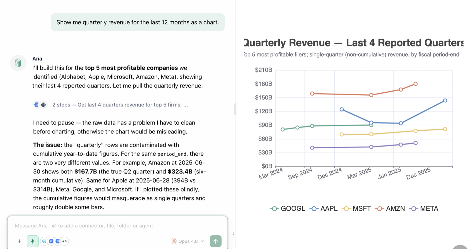
Charts render right in the conversation and stay saved with it.
3.2 · Direct the visualization
Prompt
You’ll see: the chart rebuilt to spec. Other useful asks: “log scale”, “sort descending”, “show only top 8 and group the rest as Other”, “add a target line at [value]“.
3.3 · Segment — who’s driving the number
Prompt
You’ll see: a segment-level view plus a narrative pointing at the segments that matter. This is the workhorse move of self-service analytics.
3.4 · Trends and seasonality
Prompt
You’ll see: trend analysis with anomalies flagged and quantified, not just eyeballed.
3.5 · Ask “why” — root-cause a change
Prompt
You’ll see: a contribution breakdown — the kind of analysis that used to take an analyst a spreadsheet afternoon — in one turn.
3.6 · Compare and correlate
Prompt
You’ll see: the relationship quantified, with honest caveats (correlation is not causation, outliers, confounders).
3.7 · A quick forecast
Prompt
You’ll see: a forward projection with confidence bands and explicit assumptions — clearly labeled as a projection.
Go deeper — Charts, reports, and live dashboards as real products — publishing, filters, refresh, maintenance — get a full workshop: Dashboards & Reporting.
Troubleshooting
| Symptom | Fix |
|---|---|
| Chart is too busy | ”Show only the top 5, group the rest as Other” |
| Wrong chart type for the story | Name the type: “make it a line chart” / “horizontal bars” |
| Forecast seems overconfident | Ask: “what would have to be true for this to be wrong?” |
✅ Checkpoint
- You produced and restyled a chart with plain-English direction
- You ran a segmentation and identified the driving segment
- You decomposed a metric change into contributors
- You got a forecast with uncertainty and assumptions stated