Works with SQL Tools: Python is typically used alongside Text to SQL or Ontology. Ana queries your data first, then uses Python to create visualizations and perform additional analysis.
Primary Use: Data Visualization
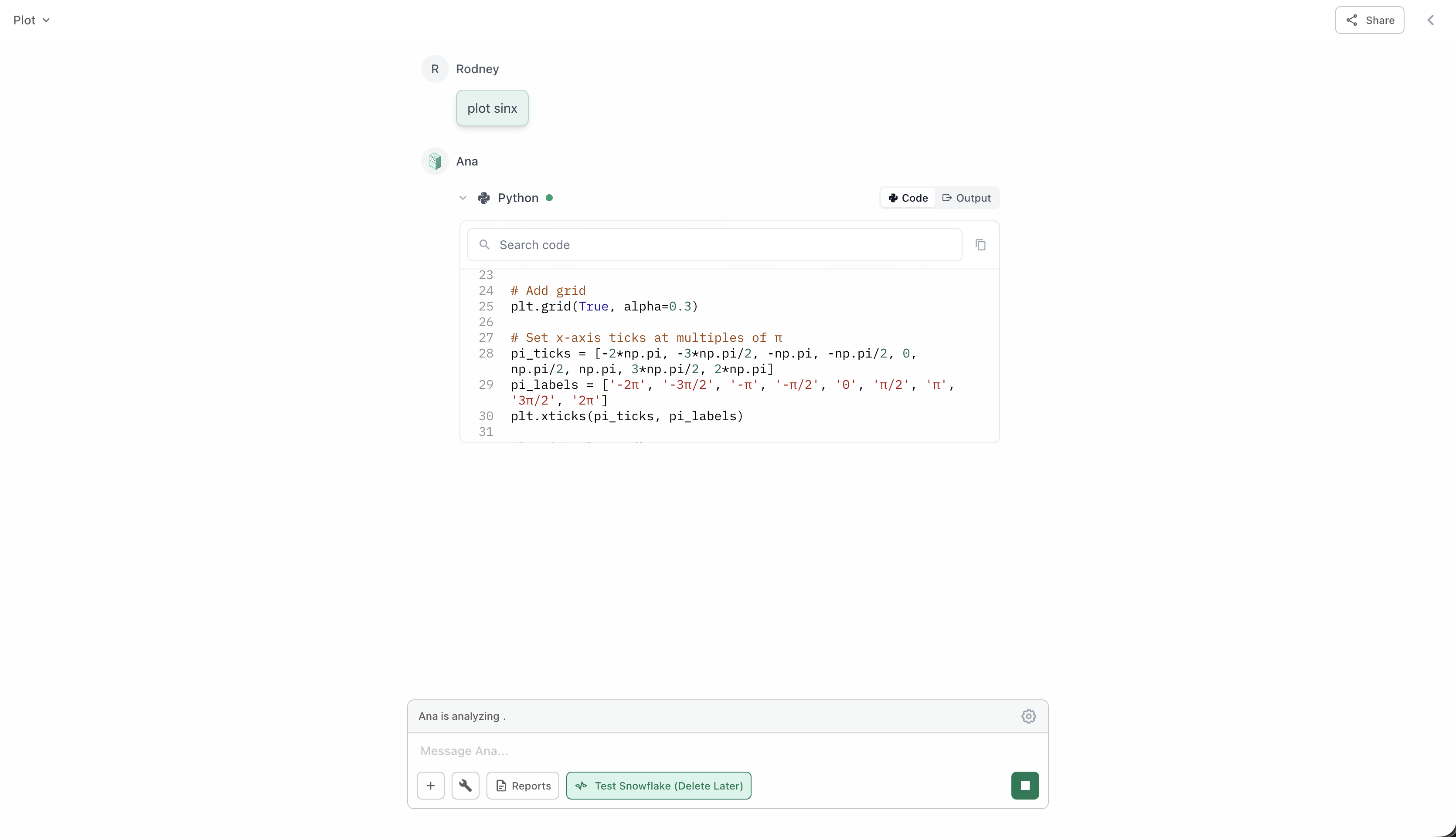
Python is mainly used to create visualizations from data retrieved by Text to SQL or Ontology queries:Charts & Graphs
“Create a bar chart of this data”“Show monthly trends as a line chart”“Make a pie chart of sales by category”
Advanced Visualizations
“Build a scatter plot with trend line”“Create a heat map of correlations”“Show this as a stacked area chart”
Interactive Maps
“Plot customer locations on a map”“Show sales by region on a map”“Create an interactive map with markers”
Statistical Plots
“Show the distribution as a histogram”“Create a box plot by segment”“Make a correlation matrix”
When to Use
Python works best after you’ve retrieved data with Text to SQL or Ontology:Query Your Data First
Start by getting the data you need using Text to SQL or Ontology.Example: “Show me monthly sales by region for 2024”
Common Workflows
- SQL → Chart
- Ontology → Visualization
- SQL → Analysis → Chart
The most common pattern:
- “Get total sales by product category”
- “Create a bar chart of that data”
Tips for Better Visualizations
Be Specific About Chart Type
Tell Ana exactly what kind of chart you want.Good: “Create a stacked bar chart showing monthly revenue by product line”Vague: “Make a chart”
Request Changes Easily
If a visualization isn’t quite right, just ask for adjustments.Examples:
- “Make that chart larger”
- “Use different colors”
- “Sort by highest to lowest”
- “Add a trend line”
Combine Visualizations
You can ask for multiple charts to compare different views.Example: “Show me a bar chart and a trend line of the same data”
Ask for Insights
Ana can calculate additional metrics to visualize.Example: “Show the data with moving averages” or “Add percentage changes”
Example Visualization Requests
Real examples of how SQL + Python work together:- Basic Charts
- Trend Analysis
- Comparisons
- Advanced
Request:
- “Get sales by month, then show it as a line chart”
- “Query top 10 products and create a bar chart”
- “Show customer distribution by state on a map”
What Else Python Can Do
While visualization is the primary use case, Python can also:Simple Calculations
Simple Calculations
- Calculate growth rates and percentages
- Compute moving averages
- Find totals and subtotals
- Determine min/max values
Data Exports
Data Exports
- Export processed data as CSV
- Create Excel files with multiple sheets
- Generate formatted reports
Statistical Analysis
Statistical Analysis
- Calculate correlations
- Perform basic regression
- Show distributions
- Identify outliers